A broadcast graphic draws a single, perfectly straight line across the pitch, colors one side red and the other blue, and settles an offside call in front of tens of millions of people with the visual authority of a ruler laid across a page. It looks like measurement. Most of what produces it is closer to a chain of careful estimates, each one small, several of them compounding by the time the line actually appears.
None of this means the technology is unreliable in any practical sense, and none of it is an argument for going back to a human eye alone. It is an argument for understanding what the line actually represents, because a picture this clean invites a confidence the underlying process cannot always support, particularly on the margin-of-a-boot calls that generate the loudest arguments.
What follows works through where the line actually comes from: frame selection, camera calibration, line thickness, and what semi-automated systems genuinely fixed versus what they simply made faster and more presentable.
The process in six lines
- Step one. Identify the exact frame the ball was played, which is itself a judgment call.
- Step two. Locate the relevant body parts of the defender and attacker in that frame.
- Step three. Translate camera pixels into real pitch coordinates using a calibrated model.
- Step four. Draw a line, with a fixed thickness, at the calculated position.
- What changed with semi-automated systems. Steps two and three now run largely automatically, and faster.
- What did not change. Step one still involves interpretation, and every step carries a small margin of error.
What offside line technology is actually drawn from
Under the Laws of the Game maintained by the International Football Association Board, offside position is judged relative to the second-to-last defender at the moment the ball is played by a teammate, not at the moment the attacker receives it. Everything the technology does is an attempt to reconstruct that single instant as precisely as possible from camera footage.
That reconstruction requires three separate pieces of information to line up correctly: the exact moment of the pass, the exact position of the relevant players at that moment, and an accurate translation from a two-dimensional camera image into real, three-dimensional positions on the pitch. Each of those three pieces is a place where a small error can enter the process before a line ever gets drawn.
Frame selection: the first source of error
Modern broadcast and tracking systems operate at high frame rates, but a ball struck firmly still travels a measurable distance between one frame and the next, which means the system has to choose a specific frame as the moment of the pass rather than capturing a continuous instant.
Choosing a frame even one interval too early or too late can shift the calculated position of a fast-moving defender or attacker by a meaningful margin, particularly for players sprinting at full speed, where a fraction of a second corresponds to real distance on the pitch. This step has improved significantly with higher frame rates and better ball-tracking data, but it has not been eliminated, because the underlying limitation is the frame rate itself rather than any correctable software flaw.
Camera calibration and the assumptions it requires
Translating a flat camera image into real pitch coordinates requires a calibrated model of exactly where every camera sits relative to the pitch, and that calibration has to account for lens distortion, camera height and angle, all of which can shift subtly over the course of a match due to vibration, temperature or minor mechanical settling.
Systems recalibrate regularly to correct for this drift, but recalibration happens on a schedule rather than continuously in real time, which means a small calibration error is possible in the window between checks. The resulting position error is usually tiny, well under the width of a boot, but tiny errors matter enormously on calls where the actual gap between two players is itself smaller than a boot.
Line thickness is not a cosmetic choice
The line drawn on screen has a real, non-zero thickness, chosen partly for visibility and partly because the underlying position data itself carries a margin of uncertainty that a perfectly thin line would misrepresent as false precision.
On a genuinely tight call, the calculated positions of the two players can fall within the thickness of the line itself, meaning the honest answer is that the measurement cannot distinguish onside from offside with full confidence, even though the broadcast graphic still has to display a single line and a single verdict either way.
What semi-automated offside changed

Before semi-automated systems, offside lines were typically drawn manually by an operator selecting reference points on a still frame, a process that took longer and introduced an additional layer of human judgment into where exactly a line got placed on each player’s body.
Automated limb-tracking removed most of that manual step, using dedicated tracking cameras and, in many implementations, a sensor inside the ball itself to determine the moment of the kick more precisely than frame-by-frame video review alone could manage. It is one of several concrete examples that keep coming up whenever coverage surveys where sports analytics is actually headed rather than where it is assumed to be headed. The headline improvement is speed: decisions that previously took several minutes of manual measurement can now be produced and checked within seconds.
What it did not change
Automating the measurement did not eliminate the underlying sources of error described above. It reduced some of them, particularly around frame selection and manual placement, while leaving others, including the fundamental limits of camera calibration and the physical thickness any drawn line has to have, essentially intact.
That distinction matters for anyone reading a broader deep dive on technology’s role in athletic performance, since speed and accuracy are frequently conflated in that kind of coverage too. What automation changed most is presentation. A faster, cleaner, more visually confident graphic is not the same thing as a more precise underlying measurement, even though the two are easy to conflate when the only thing a viewer sees is the finished line rather than the several estimation steps that produced it.
The margin of error, stated honestly
Manufacturers and governing bodies generally describe modern systems as accurate to within a few centimeters under normal conditions, which is a genuinely impressive figure for a live sporting event and considerably tighter than manual measurement ever achieved.
A few centimeters, though, is not zero, and on the closest calls, the ones that generate the most replay and the most argument, the actual gap between two players can be smaller than that stated margin. On those specific calls, the system is not lying to the viewer, but it is presenting a confident single answer to a question its own stated precision cannot fully resolve.
Why the picture looks more precise than the measurement is
A single, crisp, colored line is a format that communicates certainty regardless of how certain the underlying calculation actually was, which is a general property of this kind of broadcast graphic rather than something specific to any one offside system.
Presenting the same information as a shaded band representing the margin of error, rather than a single line, would communicate the underlying uncertainty more honestly, but it would also produce a less satisfying, less decisive-looking graphic for a broadcast built around delivering a clear verdict within seconds of a contested moment.
Reading a tight offside call without overtrusting the graphic
The practical habit worth adopting as a viewer is treating a wide, clear offside gap as reliable and treating anything decided by a margin visually smaller than the line’s own thickness with appropriate skepticism, regardless of how confidently the graphic presents it.
This is not a call to distrust the system generally, which performs its job well across the overwhelming majority of decisions it is asked to make. It is a reminder that the closest calls are, definitionally, the ones where the technology’s real margin of error matters most, which is also exactly when the graphic looks its most authoritative on screen.
What happens when the system and the assistant referee disagree
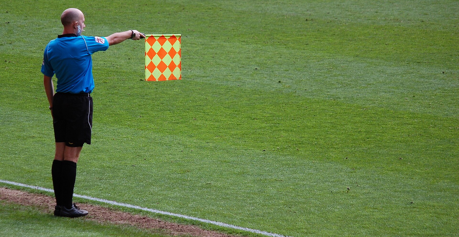
Semi-automated offside is designed to assist the video review team rather than to replace the on-field officiating structure entirely, and disagreements between the automated calculation and an assistant referee’s original flag are resolved through the same video review protocol used for any other reviewable decision, with the automated line serving as one input into that review rather than an automatic override.
In practice the automated system corrects the assistant referee’s initial call more often than the reverse, since a human eye judging a fast, tight offside in real time from a fixed touchline position is working with meaningfully less information than a system drawing on multiple tracking cameras and precise timing data. This does not mean the human official’s role has become redundant, since the same official’s judgment about a genuinely marginal calibration still enters into the final decision on the closest cases described earlier.
How this compares across different leagues and providers
Not every competition uses an identical implementation, and the specific tracking hardware, number of cameras and whether a connected ball sensor is in use all vary between leagues and even between different tournaments run by the same governing body, which means the precise margin of error is not perfectly uniform across every broadcast a viewer might watch.
Competitions with denser camera coverage and connected ball sensors generally report tighter accuracy figures than those relying on a more limited camera array without ball-tracking hardware, which is a useful piece of context for a viewer comparing how confidently a graphic is presented across two different tournaments, since the underlying measurement quality is not identical even when the on-screen line looks equally crisp in both.
What a broadcast graphic could show instead, and why it usually does not
Some broadcasters have experimented with presenting a shaded band rather than a single line on genuinely close calls, a format that communicates the underlying uncertainty more honestly by showing a range rather than a single definitive position. The experiments have generally been limited and short-lived rather than adopted as a permanent standard.
The commercial and editorial reasons for this are straightforward: a broadcast built around delivering clear, confident verdicts within seconds of a contested moment has little incentive to introduce visual ambiguity into its signature technology graphic, even when that ambiguity would more accurately represent what the underlying measurement can actually support. Viewers who understand this gap are better equipped to treat the confident line as a strong estimate rather than an infallible one, without needing the broadcast itself to change how it presents the call.
Frequently Asked Questions
Is semi-automated offside technology less accurate than fans generally assume?
Not less accurate than older manual methods, which it clearly improves on, but its precision is not unlimited, and the closest calls can fall within its stated margin of error.
Why does frame selection matter if cameras record dozens of frames per second?
Because a fast-moving ball and sprinting players can still cover real distance between two consecutive frames, meaning the chosen frame has to be treated as an estimate of the true moment rather than a perfect capture of it.
Does the technology account for a player’s exact body shape?
Modern tracking systems model specific limb positions rather than a single point on the body, which was a genuine improvement over earlier methods that relied on a single reference point.
Why does the broadcast graphic still show a single confident line if there is uncertainty?
Because a single decisive line communicates a verdict clearly to a large audience quickly, which is what the broadcast format requires, even though it does not visually represent the underlying margin of error.
Has offside line technology reduced controversy overall?
Broadly yes, since it has removed most of the larger, more obvious errors manual measurement occasionally produced. It has not eliminated argument entirely, because the closest calls will always sit near the edge of whatever margin of error the system carries.
The line on screen is not wrong to trust for the vast majority of calls it makes. It is simply worth remembering, on the closest ones, that a confident picture and a precise measurement are not automatically the same thing.