The graphic that appears on screen at half time is not a summary of the match. It is a summary of what the data feed happens to produce cheaply and in real time, which is a very different thing. Possession, total shots, corners, pass accuracy, distance covered. Four of those five can be high for a side that spent the half being taken apart.
A recap has room for perhaps five numbers before the reader stops reading them. Spending three of that budget on figures that were chosen by a broadcast producer in the 1990s is a waste of the only quantitative space the piece has.
What follows is a working list: five numbers that earn their place in a match report, four that regularly point the analysis in the wrong direction, and for each one the specific way it fails. The argument is not that the discarded four are meaningless. It is that they are ambiguous, and a number that supports two opposite conclusions is not doing any work in a paragraph.
Nine numbers, sorted
| Number | Verdict | What it actually counts | The failure it invites |
|---|---|---|---|
| Shots on target inside the box | Quote | Efforts that reached the goal from a position worth reaching it from | Small counts in low-event matches |
| Field tilt | Quote | Share of final-third touches between the two sides | Territory without penetration |
| Set-piece share | Quote | How much of the threat came from dead balls | Ignoring the corners a side earned by attacking |
| High turnovers | Quote | Ball recoveries in the attacking half | Counting recoveries that led nowhere |
| Touches in the opposition box | Quote | Volume of genuine penetration | Rewarding aimless crosses that are headed clear |
| Possession share | Avoid | Time or passes with the ball, anywhere on the pitch | Sterile circulation read as control |
| Total shots | Avoid | Every effort, from anywhere, blocked or not | A chasing side inflating the count |
| Distance covered | Avoid | Kilometres run by outfield players | Reading effort into a number that inverts |
| Pass accuracy | Avoid | Completed passes as a share of attempts | Rewarding the side that risked nothing |
What a recap number is being asked to do
A statistic in a match report is not there to be true. It is there to carry a specific sentence that would otherwise be an assertion. If the writer’s claim is that a side controlled the second half without threatening, the number has to be able to distinguish those two things. Most of the standard set cannot.
The test is simple and worth applying before any figure goes in the copy. Ask what the same number would look like if the opposite were true. If the answer is roughly the same, the number is not evidence, it is decoration.
Sixty per cent possession is compatible with a side dominating and a side being invited to hold the ball in front of a deep block. Twenty-two shots is compatible with a good attacking performance and with an hour of hopeful efforts while a goal down. Both figures survive their own negation, and that is what disqualifies them.
Five football match statistics that matter, and why these five
The five below share one property: each one is expensive for a side to accumulate accidentally. That is the whole selection criterion. A number that can be run up by a team playing badly is not measuring the thing its name suggests.
They are also all available. None of these requires a modelling step, a proprietary dataset or a subscription, which puts them at the accessible end of the wider analytical toolkit. Every one can be counted by a person watching the match with a notebook, which matters if a recap is going to be written under deadline pressure and defended afterwards.
The order below is deliberate. The first two describe what a side created and where it played, which is the frame most reports need. The third catches the most common category error in match writing. The last two are the ones that separate a performance from a style, and they are the ones most often left out because nobody puts them on a graphic.
None of the five is sufficient on its own, and the piece that quotes all five is probably overloaded. Two well-chosen figures and a sentence saying what they do not cover will outperform a paragraph of nine, because a reader carries away one number from any article and it may as well be the right one.
Shots on target inside the box, not shots
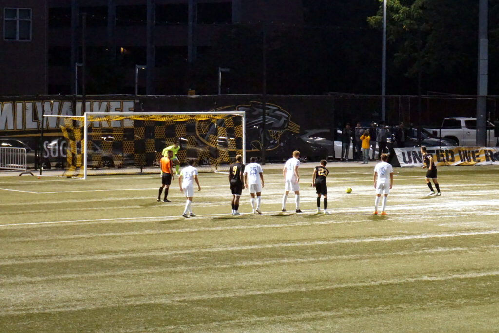
An effort from thirty metres that flies into the second tier and a header from four metres that is scrambled off the line count identically in a shots column. Adding two filters, on target and inside the penalty area, removes almost all of the noise without introducing any judgment.
What survives the filter is close to the working definition of a chance. A player got the ball into a position where scoring was plausible and hit the target from there. It is not as precise as a shot-quality model, and it does not try to be, but it moves in the same direction and a reader can verify it from the highlights.
Its weakness is honest and worth stating in the copy: in a tight match the counts are small, and the difference between three and one is not a difference anybody should build a paragraph on. When the numbers are that low, the correct move is to describe the chances rather than count them.
Field tilt, in one line and one caveat
Field tilt is the share of final-third touches between the two teams. If a side has taken seventy of the hundred touches that happened in the attacking thirds, its field tilt is seventy per cent. That is the whole calculation.
It answers the question possession is usually asked and cannot handle: where was the ball, not merely who had it. A side passing between its centre-backs contributes nothing to field tilt, which is exactly right, because those passes contributed nothing to the match either.
The caveat is territory without penetration. A team can pin an opponent in, take endless touches near the corner flag and never get into the box, and field tilt will report that as dominance. Pairing it with box touches closes the gap, and pairing anything with anything is generally how this kind of measurement gets used responsibly.
Set-piece share, and the recap that missed it
Set-piece share is the proportion of a side’s shots or box entries that began from a dead ball. It is the number most often absent from a report that later reads as wrong.
The failure case is specific. A side wins a match with two goals from corners and a report describes them as having outplayed the opposition in open play. Every underlying figure supports the story except the one that was not checked, and a reader who watched the match knows the report is describing something that did not happen.
It cuts the other way too, and this is the part writers get backwards. A team that earns eleven corners has usually earned them by attacking, and dismissing their goals as set-piece goals ignores how the set pieces arrived. The honest sentence names the share and then says whether the dead balls were the cause or the symptom.
High turnovers and the sentence they let you write
A high turnover is a ball recovered in the attacking half. Counting them is the cheapest way to make a claim about pressing concrete rather than atmospheric.
Without it, a report is left with adjectives. Aggressive, intense, on the front foot. With it, the sentence becomes checkable: a side recovered the ball in the opposition half a dozen times in the opening half hour and twice after the break, which tells the reader when the press stopped and lets them decide whether that was fatigue, a substitution or an instruction.
The refinement worth making is to count only the recoveries that produced a shot or a box entry within a few seconds. Recoveries that lead straight back to a clearance are real but they are not the thing the word pressing is being used to describe, and a recap that conflates them will overstate a side’s control.
Touches in the opposition box
This is the plainest number on the list and it is chronically underused. Every time a player takes a touch inside the opposition penalty area, it counts. There is no weighting, no model and nothing to argue about.
It works because getting into the box is difficult and stays difficult regardless of style. A possession side and a counter-attacking side arrive there by completely different routes, and the count treats both the same way, which makes it one of the few figures that compares fairly across contrasting approaches.
It can be gamed by crossing, and a side that puts thirty balls into the area will collect touches from the attackers who get a head on them. That is a real limitation and it argues for reading box touches alongside shots on target inside the box rather than instead of them.
The version worth keeping in a notebook is even coarser: box entries rather than touches. Count the number of distinct occasions the ball arrived in the penalty area under some measure of control, ignoring how many players touched it once it got there. That count is small enough to remember, hard to inflate, and it usually matches what the reader felt while watching.
Possession share and total shots: the two that arrive free
These two survive because they are already on the screen. No writer has to request them, calculate them or justify them, and a figure that costs nothing to obtain will always be over-used.
Possession share measures time or passes with the ball and makes no distinction about where. Its correlation with winning is weak enough that it should never carry a claim about control on its own, and the section of this site dealing with reading one weekend’s results against the next runs into the same problem constantly.
Total shots has a sharper defect: it rises when a team is losing. A side chasing a goal takes efforts it would never attempt at level, from distances it would never choose, and the shot count climbs as the performance deteriorates. Quoting it without noting the game state is close to quoting the opposite of what happened.
Distance covered and pass accuracy: the two that invert
Distance covered is the most misleading number in football because it looks like a measure of effort and behaves like a measure of not having the ball. Chasing costs more ground than passing, so a side that is being outplayed frequently runs further than the side outplaying it.
Used carefully, within one team across a season, it has value as a workload figure, and that is genuinely how the fitness staff use it. Used across two teams in one match as a proxy for commitment, it reliably rewards the loser.
Pass accuracy fails for a related reason. Every short backward pass raises it and every attempted through ball threatens it, so the safest side on the pitch usually posts the best number. A ninety-two per cent completion rate accumulated between three defenders and a goalkeeper describes a decision not to take risks, and printing it as evidence of quality inverts the meaning entirely.
Two sentences a recap should not print
The first is a version of dominated but lost. A side had most of the ball, most of the shots and most of the territory, and the report treats the result as an injustice. Almost every time, the figure that was not checked is shots on target inside the box, and almost every time it says the chances were bad.
The second is a version of they simply wanted it more, supported by a distance figure. It is the same sentence a report would write with no numbers at all, dressed up with one that happens to point the wrong way. If a writer wants to argue about intensity, high turnovers will carry the argument and kilometres will not.
The repair in both cases costs one clause. Replace the ambiguous figure with a specific one and state what it does not cover. A reader will forgive a hedge; they will not forgive a paragraph that contradicts what they watched, and that gap between a number and the story built on it is the recurring problem in most of the confident takes published after a weekend.
Frequently Asked Questions
Is possession share ever worth quoting?
Yes, when the story is about style rather than control. If a side that normally keeps the ball spent a match without it, the share is the fastest way to show the change, and the reader understands immediately what the number is being used for. What it cannot do is stand in for who was better.
Where does expected goals fit in this list?
It belongs alongside shots on target inside the box rather than instead of it. A shot-quality model is more precise about the value of each chance, and it also introduces a modelling step the reader cannot check from the highlights. In a recap under deadline, the plain filtered count is easier to defend.
How do you count these without a data subscription?
Four of the five can be tallied by hand during the match. Shots on target inside the box, box touches, high turnovers and set-piece origin are all binary judgments, and a notebook with four columns keeps up comfortably. Field tilt is the awkward one, because counting final-third touches live is genuinely hard.
Do these numbers work in low-scoring matches?
Less well, and the report should say so. When a match produces three shots on target between the two teams, the counts stop separating anything and the writing has to carry the analysis instead. Insisting on the numbers when the sample within a single match is that small is how a recap ends up overstating a tiny difference.
Should a report ever include the misleading four?
Sometimes, and usually to knock them down. A paragraph that quotes a lopsided possession figure and then explains why it did not translate is more useful than one that pretends the number does not exist, because readers have already seen it on the broadcast and will notice its absence.
Pick one match this weekend and keep four columns in a notebook. The report you could write from those columns will be shorter than the one the broadcast graphic supports, and considerably harder to argue with.